Headers
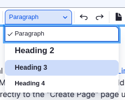
Understanding the header hierarchy and flow of your information is very important for accessibility. The first header of any section should always be placed as a header 2. Then any sub sections underneath should begin with a header 3, then 4. For example:
First Section (Header 2)
Text and content pertaining to the first section.
Sub Section (Header 3)
Text and content pertaining to the sub section
Sub Section 2 (Header 3)
Text and content pertaining to sub section 2
Sub Sub Section (Header 4)
Text and content pertaining to sub sub section
Second Section (Header 2)
Text and content pertaining to Second Section
Though it may be tempting to use different headers based on size, this will only create obstacles for users who rely on web accessible tools to navigate easily through your web pages.
When you are creating a header, you will also see a field right underneath labeled "Header ID":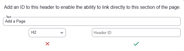
Here you can add a word that would easily reference the section of this page you want the user to be able to immediately go to called an Anchor.
Styling

Bold
 The bold button allows you to thicken the lines of text in your content. This technique is most useful when you want to catch the user's attention.
Italics
 The Italics button allows you slant the text in your content. This is most commonly used for the name of projects or particular works so it can stand out from the rest of the sentence.
Remove Format
 The Remove Format button allows to easily highlight a section of text and remove any formatting from the highlighted section all at once. For example if you wanted to remove a section that had links, bold, and italics formatting in it.
Aligning your text
There are three options you can use to align your text how you'd like. There is:
 Left Align
 Center Align
Right -Align
Justify  Justify is a new feature that will allow the text to completely fill the width of the content perfectly. In order to achieve this words will be broken off in order to maintain a perfect even edged width of text.
Bulleted List
 Bulleted lists are useful when you would like to create a list without any order, importance or chronology. For example:
You can print your work from:
- Your laptop
- A computer station
- A printing station
There are three different styles of bullets to choose from.
Numbered List
 Numbered lists are useful when you'd like to create a list where chronology is important. For example a step by step guide.
- Log into Drupal
- Then select the Content Button at the top left corner of the screen.
- Next select "Add Content"
- Then select "Page"
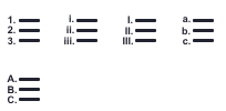
There are 5 different styles of numbered lists to choose from like Roman Numerals, numbers, and letters. When choosing what style of numbered list you would prefer you can also choose what number your numbered list should start at by clicking the "List Properties" section: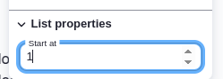
Block Quote
 Block Quotes are used to emphasize a direct quotation that is longer than 40 words or 4 lines. For example:
Lorem ipsum dolor sit amet, consectetur adipiscing elit, sed do eiusmod tempor incididunt ut labore et dolore magna aliqua. Ut enim ad minim veniam, quis nostrud exercitation ullamco laboris nisi ut aliquip ex ea commodo consequat. Duis aute irure dolor in reprehenderit in voluptate velit esse cillum dolore eu fugiat nulla pariatur. Excepteur sint occaecat cupidatat non proident, sunt in culpa qui officia deserunt mollit anim id est laborum.
Button
 Buttons are great visual tools that can be used to grab a user's attention. Once you have selected the Button Icon you will be prompted with a new screen like this:
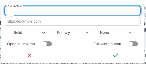
The middle drop down defaulted to Primary will give you the coyote blue color, but you can choose the color you would like the button to be by clicking on it.
- Primary (Blue): Library Homepage
- Secondary (Gray): Admissions Homepage
- Green: Give to CSUSB
- To stay consistent with CSUSB branding, Green buttons should only be used for Giving or Donation buttons.
The Button Text field is what you'd like the text for the Button to be. For example looking at the examples above the text would be "Library Homepage", "Admissions Homepage", "Give to CSUSB".
The URL field is the URL a user will be sent to when they click on your button.
You may also toggle the Full Width box if you'd like the button to take up the whole width of the section. For example:
Full Width Button for About CSUSB
The first drop down defaulted to Solid will give you a solid colored button or simply display a border around the button by clicking on it. For example:
Solid Color Button for College of Arts and Letters
Outline Button for Department of Art and Design
The third drop down defaulted to None is a list of different icons that you can use to make it even clearer what the intention of the button is. For example:
'Creativity Finds a Way': How the CSUSB College of Arts and Letters Faced COVID-19 Video
You can also toggle "Open in new tab" so when a user clicks on your button their browser will open a new tab with the link selected.
Link
 The link button allows you to make any text into a hyperlink.
- Simply highlight the text you'd like to make a link.
- Then select the link button.
- You will then be shown this screen:
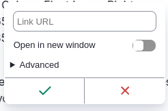
Here you will paste the URL that you'd like the user to be sent to and you'll see something like what is below after you select the Green Checkmark.
Link to the Department of Marketing
You can also choose to have the link open in a new tab by toggling the option right under the URL.
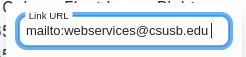
Links to Email
To create a link to an email address, follow the steps to make a link. In the URL box, you will enter mailto: followed by the email address you wish to link.
Unlink
The unlink button only becomes available when you click on links. This option allows you to remove the link function from the text and revert it back to normal text.
Anchor
Adding Anchors allows you to create a link for a user to jump to a specific section on your webpage.
Adding an Anchor to your Header
When you are creating a header, you will see a field right underneath labeled "Header ID":
Here you can add a word that would easily reference the section of this page you want the user to be able to immediately go to.
Adding an Anchor to a Link
Select the word you would like to add the anchor then select the link button: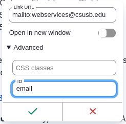
Select "Advanced" at the bottom and you'll see a field labeled "ID". Add a simple word that makes the most sense to the section you'd like a user to be able to jump to. If this text is not a link originally you can fill in the URL field with the URL of the referenced anchor, see next section for more information.
Referencing your Anchor
If you'd like to reference your anchor then you'd add the # and the label for the anchor to the end of the url I am referencing. For example: https://www.csusb.edu/web-editor-guide/drupal-content/page/edit-content-drupal-editor#file
Add a Page
File
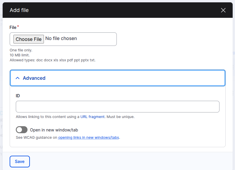
 You can add files to webpages using the file button in the editor. File uploads are limited to the
 .doc, .docx, .xls, .xlsx, .pdf, .ppt, .pptx, .txt file formats and have a size limit of 10MB.
Because file names and URLs cannot be changed in Drupal, please be as specific/precise with file names before uploading them into Drupal. The file in the following example, is an example of a bad file name. "Sample File" gives no indication as to what is contained in the file or what it is used for when searching for the file from within Drupal. A better name would be "Drupal Editor Guide Example File".
After uploading your file, the Drupal editor will display your file as a link with the file name as the link text.
You can also select specific Text like "Sample File" and then click the File button. Once the file has been uploaded the selected Text will become a link to that newly uploaded file.
Updating an Existing File
You cannot update an existing file from the normal page edit screen. If you remove the linked file from a page and upload a new file, the old file will continue to be available to the internet both directly and through Google searches. This creates outdated files and can cause confusion for users searching for specific information or files. To replace an existing file:
- Go to the Content Edit page of Drupal by selecting the "Content" link in the admin menu bar.
- Select the "Files" tab.

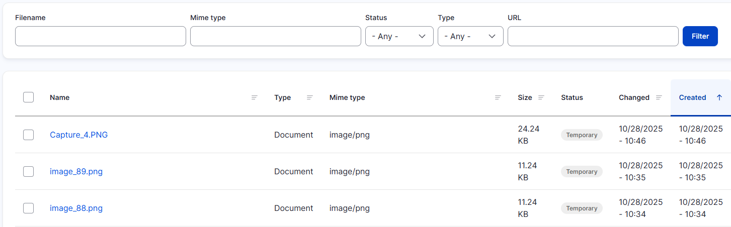
- Enter the file name in the "Filename" field or the file address in the "URL" field. Searches are wildcarded on both ends, so partial matches will still display.
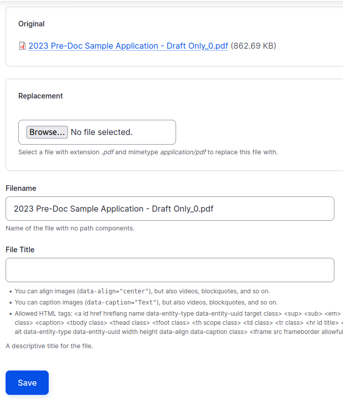
To replace a the file, select the "Replace" option for the file you wish to replace.

- Upload your new file, give the file a "File Title" and select save.
Your old file is now replaced by a new file. The new file will exist at the same URL of the old file, so links on your website will continue to work correctly and Google Searches will now return the new file. If you continue to see the old file at the file URL, please refresh your browser as you may have the old file cached in your browser.
Uploading a File in the Backend
Sometimes you may need to upload a file in the backend like for a Button. You'll need the URL first to reference to.
To upload files:
- Go to the Content Edit page of Drupal by selecting the "Content" link in the admin menu bar.
- Select the "Files" tab.
- Click the blue button "Add File" near the top right area.
- Then upload your file. Carefully read the size limits and file types that are accepted before clicking the "Next" button
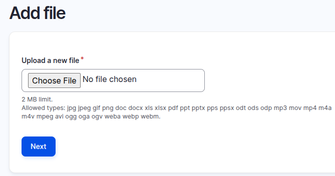
- It will ask what destination you'd like the file to go to. Simply click "Next" and accept the default.
- You will now see a link to your file, click on it and you'll see your newly uploaded PDF with the full URL up top.
- Copy and Paste your URL wherever necessary on your page
Image
 You can add images to webpages using the image button in the editor. Preferred formats are PNG and JPG with max size of 1 megabyte. It is recommended that you crop images to desired dimensions before adding them with the editor.
Once the image has been selected and uploaded you will see the following prompt: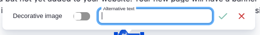
Alternative Text must be added to the image for accessibility. It should either describe the image or it should be the text within the image. Please refrain from using images with a lot of text as screen-readers are unable to pick up text on images. If the image is merely for decoration and is simple enough you can toggle the "Decorative Image" option and bypass Alt Text and select the green check-mark.
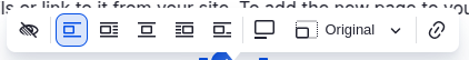
Here you can see all the options that are available to you. Here is what each option means:
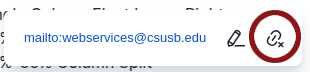
 Change Alternative Text: In case the Alt Text needs to be updated or change you can do that by selecting this button.
 Break text and align left: This forces the image to align to the left and keep clear any text to the left of it.
 Align left and wrap text: This forces the image to align to the left and wraps the text around it accordingly.
 Align center and break text: This forces the image to the center and keeps clear any text to the left and right of the image.
 Align right and wrap text: This forces the image to the right and wraps the text around it accordingly.
 Inline: This allows the image to be inserted in-between a line of text like so:
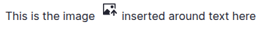
 Caption: This lets you add a caption to your image.
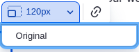 Resize Image: This lets you resize the image or reset it back to its original size.
 Link Image: Add a link to your image so when people click on the image it sends them to another page.
YouTube Video
 The Drupal page editor also allows embedding YouTube Videos.
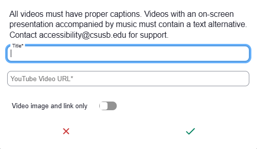
After selecting the YouTube button, you will add the title for the video you wish to embed, paste the link for the video. You can toggle 'Responsive' to fit the video player to the width of the content and selecting 'Video image and link only' will show a thumbnail of the video with a link leading to YouTube. Once finished just select the green check-mark and your video will display.
Table
 Tables can be used to display sets of data. You should never use tables simply for layout purposes. Tables hinder readability on mobile devices and should be used as a last resort when data cannot be displayed via other methods.
Adding a New Table
After selecting the table button in the Drupal editor, you will be presented with the Table Properties window.
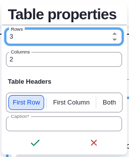
You can select the number of initial Rows and Columns that the table will have. When creating a new Table, all tables must have:
- Proper Headers (either First Row, First Column, or Both)
- A Caption describing the contents the table
| Fruit | Season | Price |
|---|---|---|
| Apple | Fall | $2 |
| Mango | Summer | $4 |
| Kiwi | Winter | $1 |
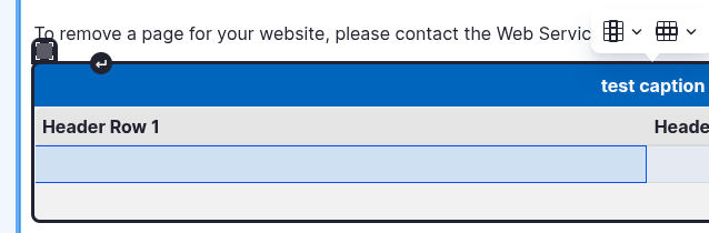
This table uses the first row as the headers, which describes the data in the corresponding columns and uses "Fruit Available for Sale" as the Caption to describe the entire data set in the table.
Adding extra rows or columns Table
To add extra rows and columns you will click a table cell near the column or row you would like to add then you'll notice a prompt on top of the table appear.
The icon highlighting columns ( ) Will give you options Insert a Column left or Right, Delete the Selected Column, or Select the entire Column. The same options will appear when selecting the icon highlighting rows (
 )
)
Delete or move a Table
If you would like to completely get rid of a table or need to move the table higher or lower in your content you can click the icon in the top left corner of the table. Simply drag and drop the table to its desired area or just delete.:
Info Block
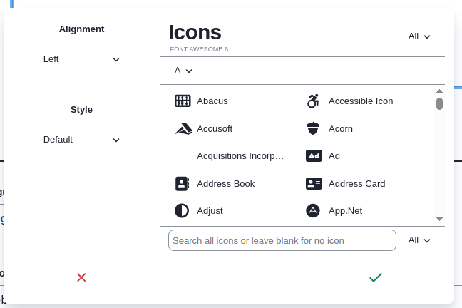
 You can add an info block to display content within a decorative block. When creating an info block you can align it within the page, choose between blue and grey blocks under Style, and add many different icons from the Font Awesome gallery that you can search for within the Edit Options. Info blocks can be useful when you wish to draw the attention of visitors.
Accordion
An accordion is a design element that expands in place to expose hidden information. This can be useful when creating FAQs sections.
New Accordion Item Content
New Accordion Item Content
For our first-year students, it is not required for parents or family members to attend Orientation with you, however we do have a Parent and Family orientation program just for them! We strongly encourage family members to attend our Parent and Family Orientation. This is a good time to learn about resources available at CSUSB to help families support their students. Your family can also learn about Parent and Family Orientation and special events just for them by visiting the Parent and Family Orientation page.
Parent and Family Orientation is only offered concurrently with our first-year orientation program, not with our transfer orientation program at this time.
In order to attend Orientation at the Palm Desert Campus, your major must be offered at PDC. Otherwise, you must attend Orientation at the San Bernardino campus. For more details about Orientation at the Palm Desert Campus, visit their website or call them at 760.537.8234.
The "Orientation Hold" is an advising hold that will be removed AFTER you complete Orientation. If you have completed Orientation and the hold is still active on your account, please contact the Orientation and First Year Experience at 909.537.5233 or orientation@csusb.edu.
Creating an Accordion
When editing a Page or other Content types in Drupal, the "Insert an Accordion" button is available in the content editor.
- Click on the Insert Accordion
- This will automatically create the first accordion for you. When selected you'll see these buttons appear at the top or bottom of the Accordion
- To add more Accordion items, click on (
 ). Here you can add an accordion above or below the currently selected Accordion.
Deleting and Sorting Accordion Items
To delete items, select the desired Accordion item by clicking on the Handle Icon and simply pressing Backspace/Delete key.
To sort items, click on the Handle Icon and drag the handle icon to a different location in-between items.